HOPE Family Health
HOPE Family Health is a faith-based nonprofit health center passionately devoted to extending primary, mental health, dental, and pharmacy services to those left out by the traditional healthcare system.

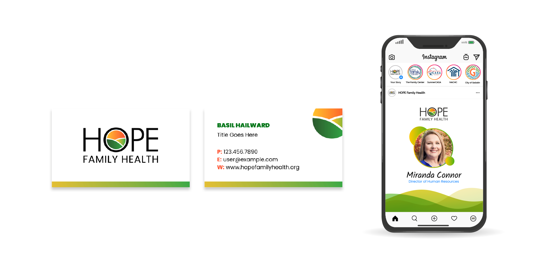
Introducing the refreshed HOPE Family Health logo. Using the colors from the updated brand more depth and dimension are created within the negative space of the “o”.
In addition, “Family Health” changed from title case to all caps to tie back to “HOPE” with a new weight of the font to Poppins “Medium” in order to create a better visual balance.

New font pairings are explored to evoke bold and strong uses of type and copy while inviting a new, sophisticated look as well.
The color palette is inspired by our personality attributes — Passionate, Welcoming, Committed, Resolute — and helps create a vibrant experience for their customers.

Colors and fonts play a big role in a brand’s look and feel, but the way they come together in graphics and design is where our identity will really sing. Bold gradients and thick outline strokes create emphasis and boldness. Compliments of circular and sharp containers mirror the organic nature of the logo and its elements.


